Predictive Model
From the previous data exploration and visualization, we found some interesting trend worthy of further analysis and some independent variables could be ideal in predicting the possible outcome. Thus, we decided to imply the concept of linear regression model here to build a predictive model for delay time since the outcome is continuous.
Variable Description
Outcomes of interest: delay time (in minutes)
Predictors of interest:
Categorical: airlines, months, times of the day
Continuous: carrier delay, extreme weather delay, late arrival delay, NAS delay, security delay, temperature, humidity, visibility, wind speed
Step 1: Data Exploration
Data Normalization
Distribution of Outcome
delay_hist = raw_df %>%
  ggplot(aes(x = delay)) +
  geom_histogram(fill = "Orange", color = "Orange", bins = 50) +
  geom_vline(aes(xintercept = mean(delay)), color = "blue",
             linetype = "dashed") +
  labs(title = "Distribution of Delay Time, 11/1/2021 to 1/31/2022",
       x = "Delay Time (minutes)",
       y = "Count") +
  theme_classic()

delay_hist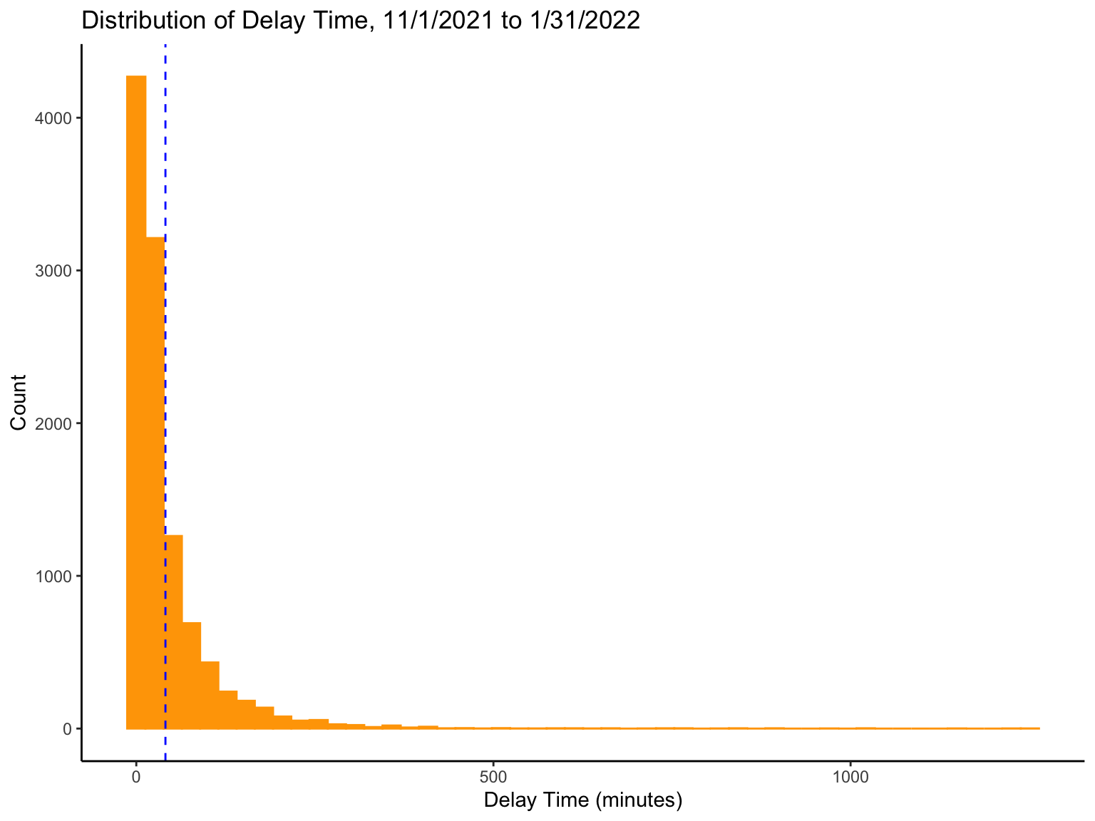
Issues with the current outcome variable:
Skewness: This distribution is highly skewed with many extreme outliers, which will negatively impact a statistical model’s performance.
Disagreement: The scale of the outcome variable (delay time) is from 0 to +infinity, whereas the scale of the linear function is from -infinity to +infinity. This disagreement will prevent us from applying a linear regression model to this data.
Solutions:
To address the two issues above, we can apply a Log transformation to normalize the outcome variable so that we can also make it scale in line with our proposed model.
Log Transformation
log_df = raw_df %>%
  mutate(log(as.data.frame(delay))) %>%
  mutate(month = fct_relevel(month, "Nov", "Dec", "Jan")) %>%
  select(-date)

logdelay_hist = log_df %>%
  ggplot(aes(x = delay)) +
  geom_histogram(fill = "Orange", color = "Orange", bins = 15) +
  geom_vline(aes(xintercept = mean(delay)), color = "blue",
             linetype = "dashed") +
  labs(title = "Distribution of Log Delay Time, 11/1/2021 to 1/31/2022",
       x = "Log(Delay Time)",
       y = "Count") +
  theme_classic()

logdelay_hist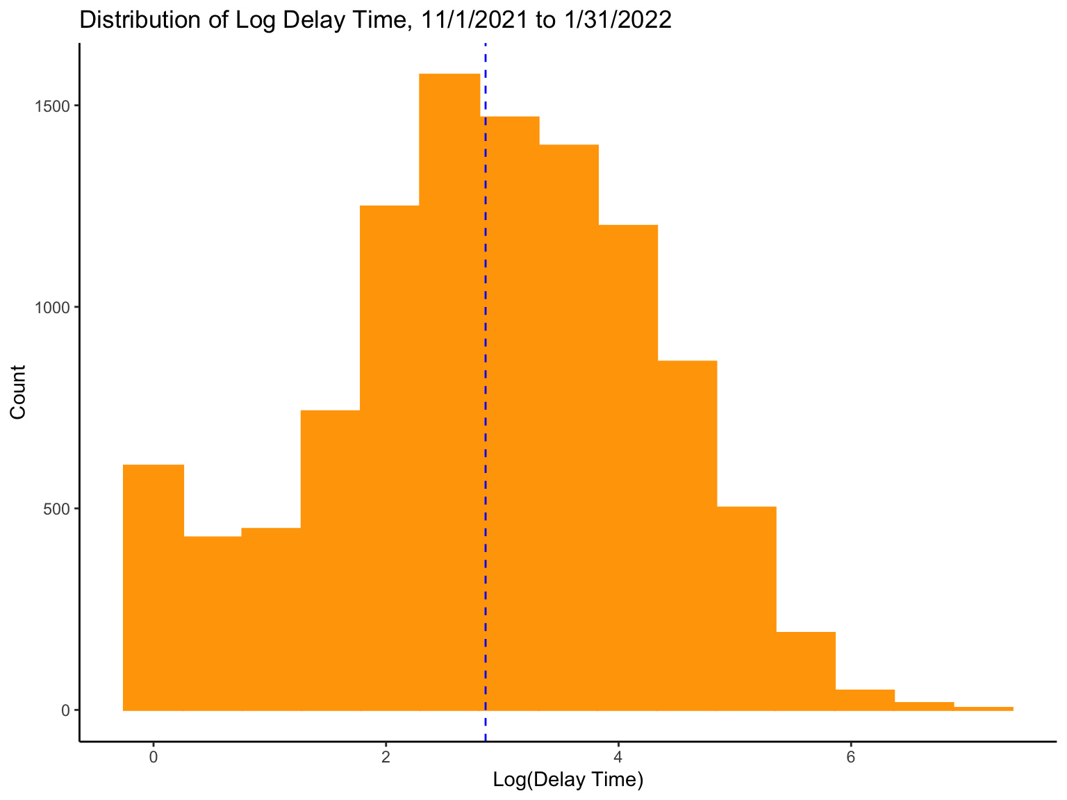
Highlights:
- Now, the distribution looks normally distributed and the underlying scales for both side of equation will be in agreement. Problem solved.
Effect of Potential Predictors
Motivation:
To get a sense of the effect of each predictor.
Plan:
- For categorical variables:
We first produce boxplots to visualize the distribution of delay time across each categorical group. Then, we perform ANOVA to see if each group has the same average delay time. For those significant, we perform pairwise t-tests using Bonferroni’s correction for the p-values to calculate pairwise differences between the delay time of each group.
- For continuous variables:
We first produce scatterplots to visualize the relationship between the continuous outcome and each continuous predictor to see if there is a linear relationship. We also calculate correlation coefficients for all continuous variables to measure the associations and detect if any strong linear correlations.
Categorical Predictors
#function for boxplot
box_cat = function(cat){

  box = log_df %>%
    plot_ly(x = ~cat, y = ~delay, color = ~cat,
          type = 'box', colors = "viridis") %>%
    layout(
    yaxis = list(title = "Log(Delay Time)"))

}
Airlines
| Effect | SSn | SSd | DFn | DFd | F | p | p<.05 | ges |
|---|---|---|---|---|---|---|---|---|
| airline | 733.466 | 19930.18 | 6 | 10740 | 65.875 | 9.5e-81 |
|
0.035 |
| group1 | group2 | p.value |
|---|---|---|
| American Airlines | Alaska Airlines | 1.00e+00 |
| Delta Air Lines | Alaska Airlines | 1.00e+00 |
| Delta Air Lines | American Airlines | 1.00e+00 |
| Endeavor Air | Alaska Airlines | 1.00e+00 |
| Endeavor Air | American Airlines | 7.94e-03 |
| Endeavor Air | Delta Air Lines | 2.50e-02 |
| JetBlue Airways | Alaska Airlines | 5.09e-06 |
| JetBlue Airways | American Airlines | 4.04e-46 |
| JetBlue Airways | Delta Air Lines | 2.31e-56 |
| JetBlue Airways | Endeavor Air | 5.51e-08 |
| Republic Airways | Alaska Airlines | 6.60e-01 |
| Republic Airways | American Airlines | 7.30e-08 |
| Republic Airways | Delta Air Lines | 1.79e-07 |
| Republic Airways | Endeavor Air | 1.00e+00 |
| Republic Airways | JetBlue Airways | 9.85e-07 |
| United Air Lines | Alaska Airlines | 1.00e+00 |
| United Air Lines | American Airlines | 4.75e-01 |
| United Air Lines | Delta Air Lines | 7.72e-01 |
| United Air Lines | Endeavor Air | 1.00e+00 |
| United Air Lines | JetBlue Airways | 1.00e+00 |
| United Air Lines | Republic Airways | 1.00e+00 |
Highlights:
Since the overall p-value (9.5e-81) is less than .05, this is an indication that each airline group does not have the same average delay time.
The adjusted p-value for the mean difference in delay time between JetBlue Airways vs. American Airlines and Delta Air Lines both are <4.1e-46, which suggests highly different.
The adjusted p-value for the mean difference in delay time between American Airlines vs. Republic Airways is 7.3e-08, which also suggests highly different.
Months
| Effect | SSn | SSd | DFn | DFd | F | p | p<.05 | ges |
|---|---|---|---|---|---|---|---|---|
| month | 450.198 | 20213.45 | 2 | 10744 | 119.646 | 4.06e-52 |
|
0.022 |
| group1 | group2 | p.value |
|---|---|---|
| Dec | Nov | 2.99e-08 |
| Jan | Nov | 5.90e-51 |
| Jan | Dec | 3.74e-22 |
Highlights:
Since the overall p-value (4.06e-52) is less than .05, this is an indication that each month group does not have the same average delay time.
The adjusted p-value for the mean difference in delay time between November, 2021 vs. December, 2021 is 3e-08, which suggests significantly different.
The adjusted p-value for the mean difference in delay time between January, 2022 vs. November, 2021 and December, 2021 are both <3.8e-22, which suggests highly different.
Times of the Day
| Effect | SSn | SSd | DFn | DFd | F | p | p<.05 | ges |
|---|---|---|---|---|---|---|---|---|
| hour_c | 162.905 | 20500.74 | 3 | 10743 | 28.456 | 2.55e-18 |
|
0.008 |
| group1 | group2 | p.value |
|---|---|---|
| noon | morning | 2.03e-03 |
| afternoon | morning | 6.76e-08 |
| afternoon | noon | 1.51e-01 |
| night | morning | 6.84e-18 |
| night | noon | 2.22e-07 |
| night | afternoon | 7.35e-03 |
Highlights:
Since the overall p-value (2.55e-18) is less than .05, this is an indication that each hour group does not have the same average delay time.
The adjusted p-value for the mean difference in delay time between morning vs. night is 6.84e-18, which suggests highly different.
The adjusted p-value for the mean difference in delay time between noon vs. night is 2.22e-07, which also suggests highly different.
Continuous Predictors
#function for scatterplot

scat_con = function(con){

  scat = log_df %>%
  plot_ly(x = ~con, y = ~delay,
          type = 'scatter', mode = 'markers', alpha = .5) %>%
    layout(
      yaxis = list(title = "Log(Delay Time)"))
}
Types of Delay
# Carrier Delay
CD_s = scat_con(log_df$carrierd) %>%
  layout(xaxis = list(title = "Carrier Delay"))

# Extreme Weather Delay
EDW_s = scat_con(log_df$extrmwd) %>%
  layout(xaxis = list(title = "Extreme Weather Delay"))

# Late Arrival Delay
LAD_s = scat_con(log_df$latarrd) %>%
  layout(xaxis = list(title = "Late Arrival Delay"))

# NAS Delay
NASD_s = scat_con(log_df$nasd) %>%
  layout(xaxis = list(title = "NAS Delay"))

# Security Delay
SD_s = scat_con(log_df$securityd) %>%
  layout(xaxis = list(title = "Security Delay"))

Type_delay_scatter = subplot(CD_s, EDW_s, LAD_s, NASD_s, SD_s, nrows = 2, titleY = TRUE, titleX = TRUE, margin = 0.1) %>%
  layout(showlegend = FALSE, title = 'Relationships between Log(delay) and 5 Types of Delay',
         plot_bgcolor = '#e5ecf6',
         xaxis = list(
           zerolinecolor = '#ffff',
           zerolinewidth = 1,
           gridcolor = 'ffff'),
         yaxis = list(
           zerolinecolor = '#ffff',
           zerolinewidth = 1,
           gridcolor = 'ffff'))

Type_delay_scatter
Weather Specific Delay
# Temperature
T_s = scat_con(log_df$temperature) %>%
  layout(xaxis = list(title = "Temperature"))

# Humidity
H_s = scat_con(log_df$humidity) %>%
  layout(xaxis = list(title = "Humidity"))

# Visibility
V_s = scat_con(log_df$visibility) %>%
  layout(xaxis = list(title = "Visibility"))

# Wind Speed
WS_s = scat_con(log_df$wind_s) %>%
  layout(xaxis = list(title = "Wind Speed"))

Weather_delay_scatter = subplot(T_s, H_s, V_s, WS_s, nrows = 2, titleY = TRUE, titleX = TRUE, margin = 0.1) %>%
  layout(showlegend = FALSE, title = 'Relationships between Log(delay) and 4 Types of Weather Specific Delay',
         plot_bgcolor = '#e5ecf6',
         xaxis = list(
           zerolinecolor = '#ffff',
           zerolinewidth = 1,
           gridcolor = 'ffff'),
         yaxis = list(
           zerolinecolor = '#ffff',
           zerolinewidth = 1,
           gridcolor = 'ffff'))

Weather_delay_scatter
Pearson Correlation
cor_po = log_df %>%
  select(-airline, -month, -hour_c) %>%
  cor(y = log_df$delay, x = ., method = c("pearson"))

round(cor_po, 2) %>%
  knitr::kable() %>%
  kable_styling(bootstrap_options = "hover") %>%
scroll_box(width = "100%", height = "220px")| delay | 1.00 |
| carrierd | 0.53 |
| extrmwd | 0.14 |
| nasd | 0.11 |
| securityd | 0.05 |
| latarrd | 0.38 |
| temperature | -0.11 |
| humidity | 0.05 |
| visibility | -0.09 |
| wind_s | 0.04 |
Highlights:
The Pearson correlation coefficient for the relationships between delay time and carrier delay is also greater than .50, which suggests potential linear association between the two.
There is no linear relationship observed between weather specific causes of delay and the delay time, which goes against our common sense. This may be due to limitations of our source data, which will be discussed later.
Step 2: Model Fitting
Motivation:
To build a linear model for predicting the delay time
Plan:
We proposed 2 rationales for modeling:
- Rationale 1 (Model 1):
According to the result from Step 1, we get a sense of what
predictors should be included in the linear regression model. They are
airline, month, times in a day
(aka. hour_c), carrier delay (aka.
carrierd), and late arrival delay (aka.
latarrd), including variables with significant F test
statistics and those with correlation coefficients greater than 0.3.
- Rationale 2 (Model 2):
According to the result from Step 1, along with our common senses and
previous experience about delay time, we propose that the rest 7
variables (extreme weather delay time (aka.
extrmwd), NAS delay time (aka.
nasd), security delay time
(aka.securityd), temperature,
humidity, visibility, wind speed
(aka. wind_s)) could also predict the delay time. Given the
large sample size (n=10747), we include all predictors of interests into
the linear regression model, while ignoring the results from any
hypothesis testing.
Fitting Model 1
Before fitting the linear model with these 5 predictors, let’s check their independence using correlation to filter out highly correlated variables.
Check Collinearity
CM_1 = log_df %>%
  select(airline, month, hour_c, carrierd, latarrd) %>%
  mutate(
    airline = as.numeric(airline),
    month = as.numeric(month),
    hour_c = as.numeric(hour_c)
    ) %>%
  rename(
     "carrier delay" = carrierd,
     "late arrival delay" = latarrd,
    "times in a day" = hour_c) %>%
  cor(method = c("pearson", "kendall", "spearman"))

testRes = log_df %>%
  select(airline, month, hour_c, carrierd, latarrd) %>%
  mutate(
    airline = as.numeric(airline),
    month = as.numeric(month),
    hour_c = as.numeric(hour_c)
    ) %>%
  rename(
     "carrier delay" = carrierd,
     "late arrival delay" = latarrd,
    "times in a day" = hour_c) %>%
  cor.mtest(conf.level = 0.95)

## specialized the insignificant value according to the significant level
corrplot(CM_1, p.mat = testRes$p, sig.level = 0.05, order = 'hclust', addrect = 2)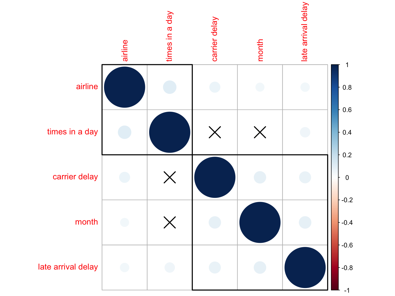
Highlights:
- All predictors are highly independent to each other.
As we see above, independence assumption is met and thus we can add all these 5 predictors into to linear regression model.
Model 1, Without Interaction
lm_1 = lm(delay ~ airline + month + hour_c + carrierd + latarrd, data = log_df)

broom::glance(lm_1) %>%
  select(r.squared, statistic, p.value, df) %>%
  mutate(p.value = recode(p.value, '0' = '<2.2e-16')) %>%
  knitr::kable() %>%
kable_styling(bootstrap_options = "hover")| r.squared | statistic | p.value | df |
|---|---|---|---|
| 0.4220695 | 602.9567 | <2.2e-16 | 13 |
Highlights:
The F-value is 603 (very large) with p-value < 2.2e-16 (very small), which suggests that this regression model is statistically significant.
However, the R-squared value is only 0.422, which means only 42% of the variability observed in the delay time is explained by the regression model. Again, this may be due to limitations of our source data.
Fitting Model 2
Model 2, Without Interaction
lm_2 = lm(delay ~ ., data = log_df)
broom::glance(lm_2) %>% select(r.squared, statistic, p.value, df) %>% mutate(p.value = recode(p.value, '0' = '<2.2e-16')) %>%
  knitr::kable() %>%
kable_styling(bootstrap_options = "hover")| r.squared | statistic | p.value | df |
|---|---|---|---|
| 0.4524891 | 443.2239 | <2.2e-16 | 20 |
Highlights:
The F-value is 443 (very large) with p-value < 2.2e-16 (very small), which suggests that this regression model is also statistically significant.
Same as model 1, the R-squared value is only 0.452, which is still not sufficient for good prediction purpose. The difference in R-squared values from model 1 and model 2 also implies that the additional predictors added into model 2 are not necessary.
Interactions
From the previous exploration steps focusing on interactions, we
further hypothesize 3 interaction terms
(Temperature * Month, Carrier * Airline,
Month * Airline) that could be potentially added into the
above model to enhance its predicting power.
Model Comparison
To examine if the addition of interaction terms is necessary, we have 4 linear models to be compared, they are:
Model 1. delay ~ airline + month + hour_c + carrierd + latarrd
Model 2. delay ~ .
NOTE: . stands for all predictors.
Model 3. delay ~ airline + month + hour_c + carrierd + latarrd + temperature + temperature * month + carrierd * airline + month * airline
NOTE: By assuming an interaction between temperature and month, we need to include both variable into the model as well.
Model 4. delay ~ . + temperature * month + carrierd * airline + month * airline
Cross-validation
set.seed(123)

# Cross Validation
cv_df =
  crossv_mc(log_df, 100) %>%
  mutate(train = map(train, as_tibble),
         test = map(test, as_tibble)) %>%
  mutate(
    model1 = map(train, ~lm(delay ~ airline + month + hour_c + carrierd + latarrd, data = .x)),
    model2 = map(train, ~lm(delay ~ ., data = .x)),
    model3 = map(train, ~lm(delay ~ airline + month + hour_c + carrierd + latarrd + temperature + temperature * month + carrierd * airline + month * airline, data = .x)),
    model4 = map(train, ~lm(delay ~ . + temperature * month + carrierd * airline + month * airline, data = .x))) %>%
  mutate(rmse_model1 = map2_dbl(model1, test, ~rmse(model = .x, data = .y)),
         rmse_model2 = map2_dbl(model2, test, ~rmse(model = .x, data = .y)),
         rmse_model3 = map2_dbl(model3, test, ~rmse(model = .x, data = .y)),
         rmse_model4 = map2_dbl(model4, test, ~rmse(model = .x, data = .y)))

cv_df %>%
  select(starts_with("rmse")) %>%
  pivot_longer(
    everything(),
    names_to = "model",
    values_to = "rmse",
    names_prefix = "rmse_") %>%
  mutate(model = fct_inorder(model)) %>%
  ggplot(aes(x = model, y = rmse, fill = model)) +
  geom_violin(alpha = .7) +
  labs(x = "Model", y = "Root Mean Square Error (RMSE)",
       title = "Model Comparison of the Cross-Validated Prediction Error") +
  scale_x_discrete(labels = c("Model 1", "Model 2", "Model 3", "Model 4"))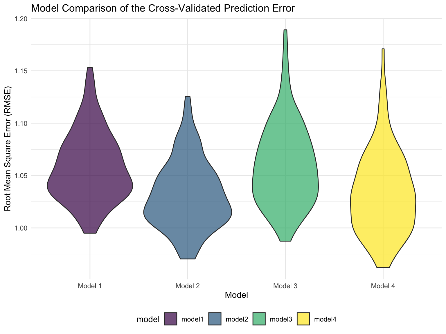
Highlights:
The RMSE for all 4 models are around 1, which is not too bad regarding to the fit of this model (distance between predictions and observed values).
On the RMSE scale, there is not much difference between the 4 models, so we will choose model 1 for parsimony.
Step 3: Model Diagnostics
Motivation:
After we choosing model 1 as the final model, we would like to look further into the model itself, i.e., model performance.
Plan:
We generated a diagnostic plot of residuals against fitted values to examine the distribution of residuals errors and to detect non-linearity, unequal error variances, and outliers.
Residuals vs. Fits
log_df %>%
  add_residuals(lm_1) %>%
    add_predictions(lm_1) %>%
  ggplot(aes(x = pred, y = resid)) +
  geom_point(color = "orange")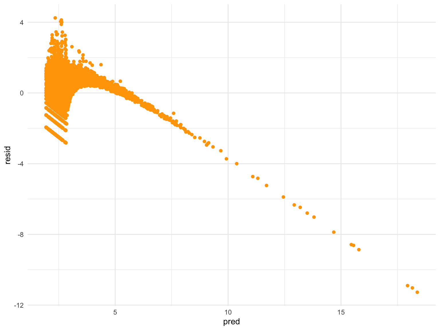
Highlights:
From the residuals versus fits plot, we observe a decreasing linear relationship between residuals and fitted values, which is not a good sign for model performance. This plot suggests the following 3 issues with model 1 that need our further inspection:
Relationship is NOT LINEAR.
Variances of the error terms are NOT EQUAL.
Outliers EXIST.
Conclusions and Discussions
In this “Predictive Model” section, we fit a linear regression model with 5 predictors, they are: airlines, months, times of the day, carrier delay time, and late arrival delay time. This model is tested to be significant and without collinearity, however, there are still many problems with our current model:
Relatively small R-squared value.
The bad fit of residuals versus fits plot.
Unclear linearity between the outcome variable and each predictor.
Results seem unreliable, i.e., it is hard for us to agree on the suggested result showing weather will not affect the delay time.
Inefficient predictive modeling. Although the parsimony of model is not the first priority when doing prediction, the number of parameters in model 1 is still too many compared to general predictive model. Meanwhile, even with 5 predictors, the R-squared is still not strong, thus I more doubt about the efficiency of our final model.
Next Steps
To this end, we come up with some possible solutions:
Try to apply a different model (other than linear regression) for the outcome data.
Collect a dataset with longer time intervals, currently, our data were collected between November 2021 to January 2022 which is a very short period to observe a predictable trend. Meanwhile, the weather of these 3 months will be very similar in New York City, this could be the explanation of the non-commonsense finding about weather-specific variables. A larger dataset with data collected on longer time intervals is needed to solve the problem.
Modify the dependent variables, e.g., create delay time categories into “short”, “bearable”, “extreme”, probably with multiple levels.
Modify the independent variables, e.g., humidity, which was observed a non-linear relationship with delay time, can be coded as a ordinal variable.
We hope we can solve the above problems later with more effort!